Case Study:
Secure Threading for Encrypted Email
Overview
Virtru’s Secure Reader (SR) is a web app that allows reading and replying to encrypted email. But SR displays only one message at a time. Following an encrypted email conversation means jumping between your email client and SR to read more than one message. Virtru customers need to see earlier encrypted emails in a thread with minimal friction in a performant way, even for long threads.
Skills Used
- user flows
- visual design
- product metrics
- usability testing
Problem Definition
Secure Reader users want to read all the messages in an encrypted email thread even if they open a later message. Currently, users have to find separate emails in their email client and click a link to Secure Reader to decrypt each individual message.
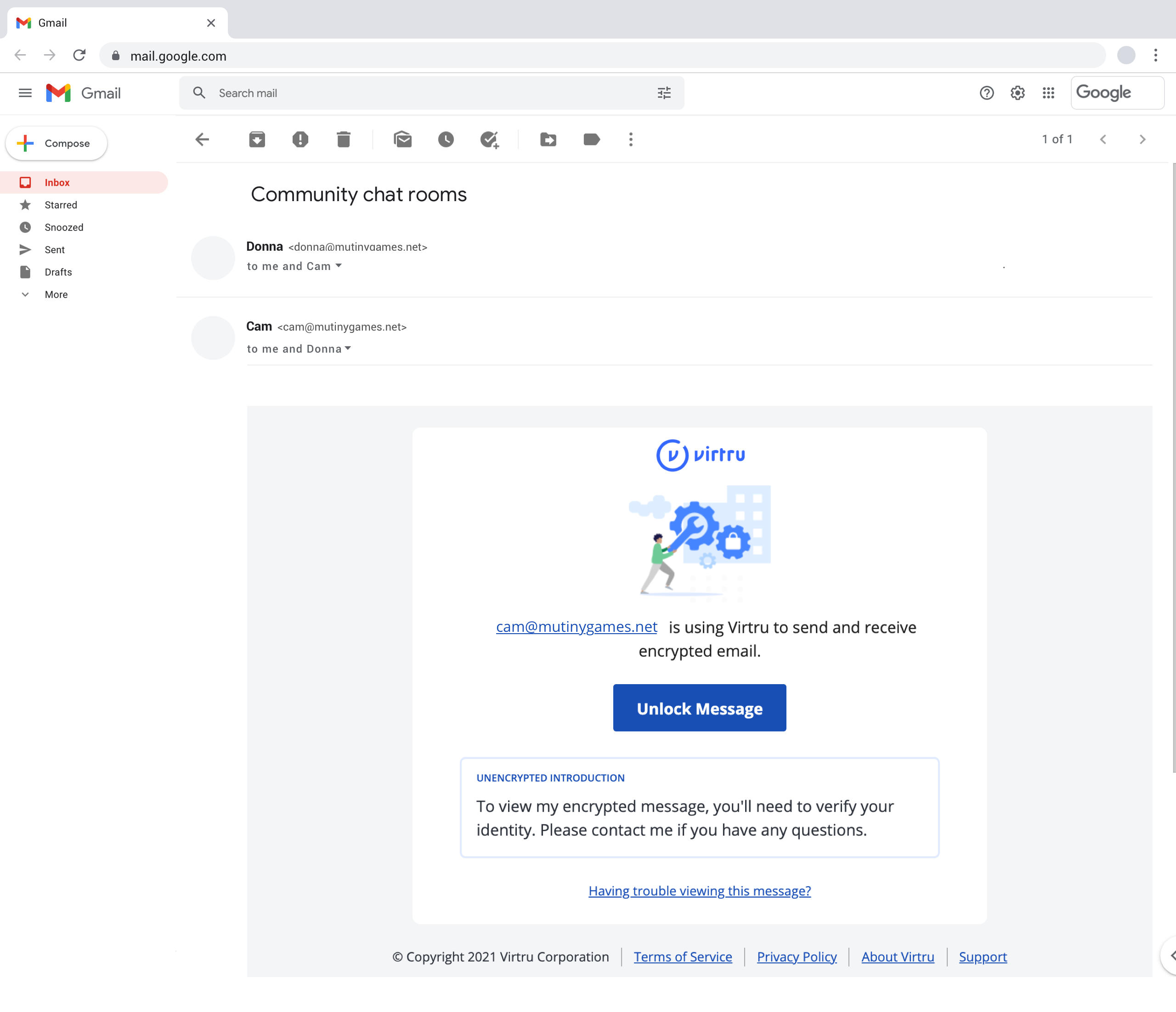
Step 1. Find latest encrypted email (2 of 2)
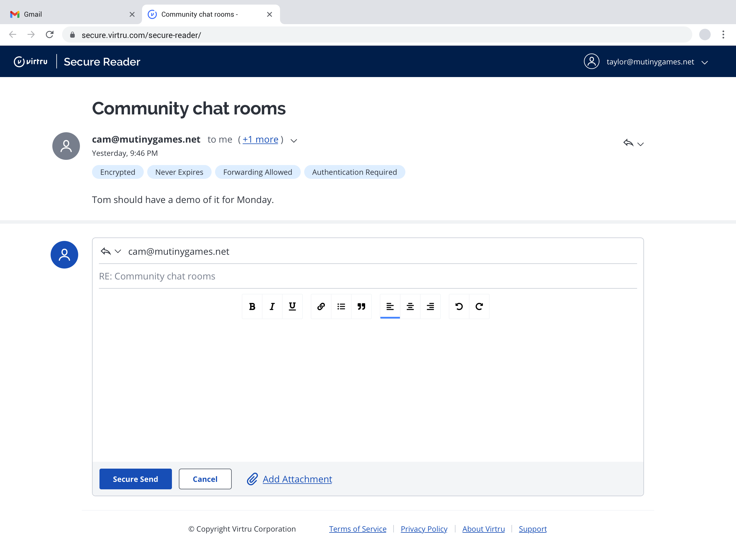
Step 2. Authenticate & decrypt latest email
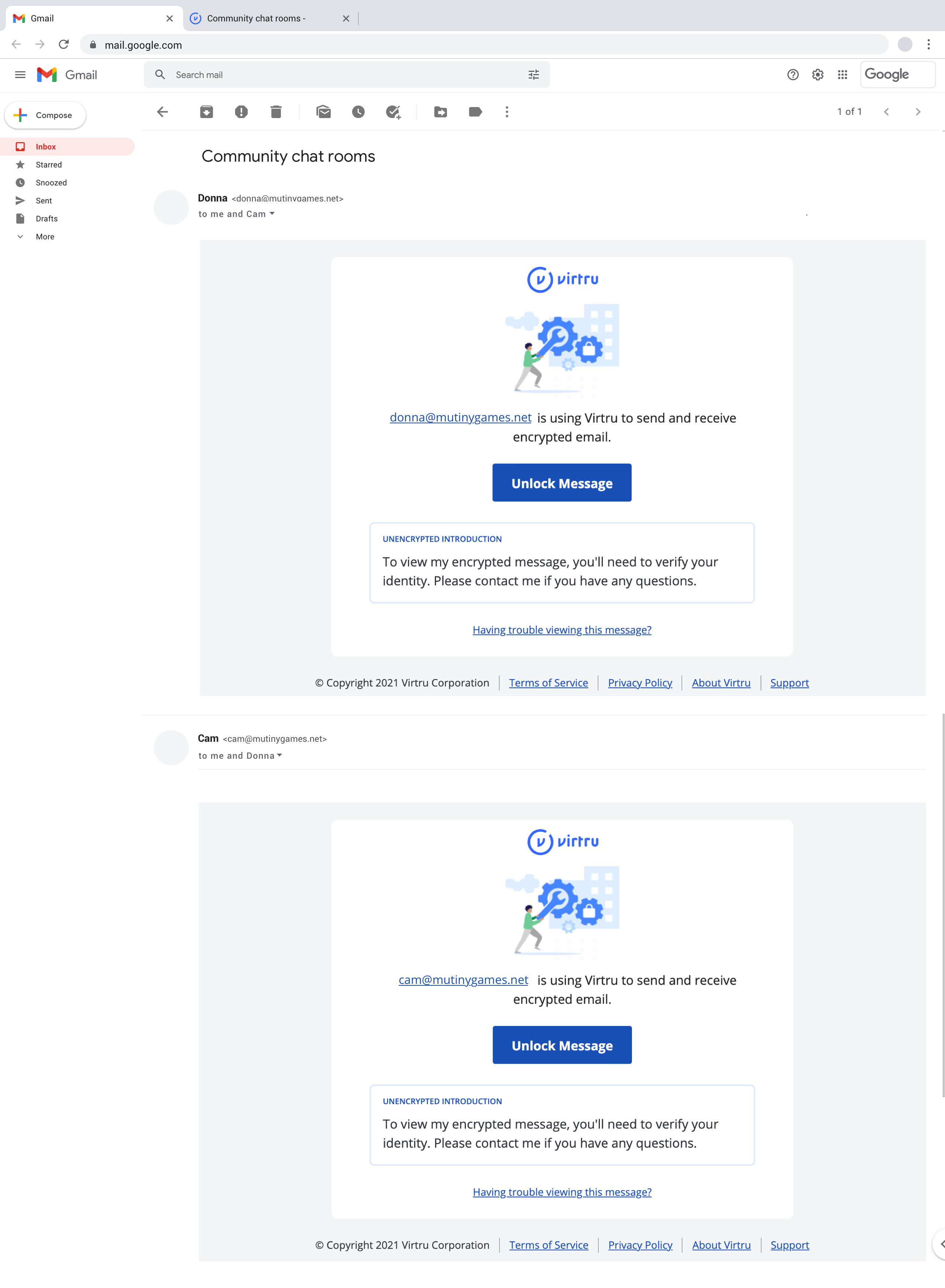
Step 3. Find previous encrypted email (1 of 2)
Step 4. Authenticate & decrypt previous email (1 of 2)

- Understand if users expect "threading" to mean conversation view, quoted content, or something else.
- Preserve as much email context as possible.
- Must not sacrifice performance or time to decrypt.
- Must work well on mobile web.
- Ideally, support threads of any length (1 message to many).
Team
- Senior Interaction Designer (me) to design solutions
- a Front-end Engineer to implement
- a Product Manager to prioritize
- a User Researcher to evaluate
Design Process
Product Management asked me to design for Secure Reader (SR) threading in Spring 2021. Engineering had already started evaluating technical feasibility and exploring implementations. My first discussions and anecdotal research ensured we built the best slice of this feature, not everything various customers thought it should be.
1. Choose “threading” definition
The first problem was that email “threading” is ambiguous.
Conversation view in Gmail and Outlook
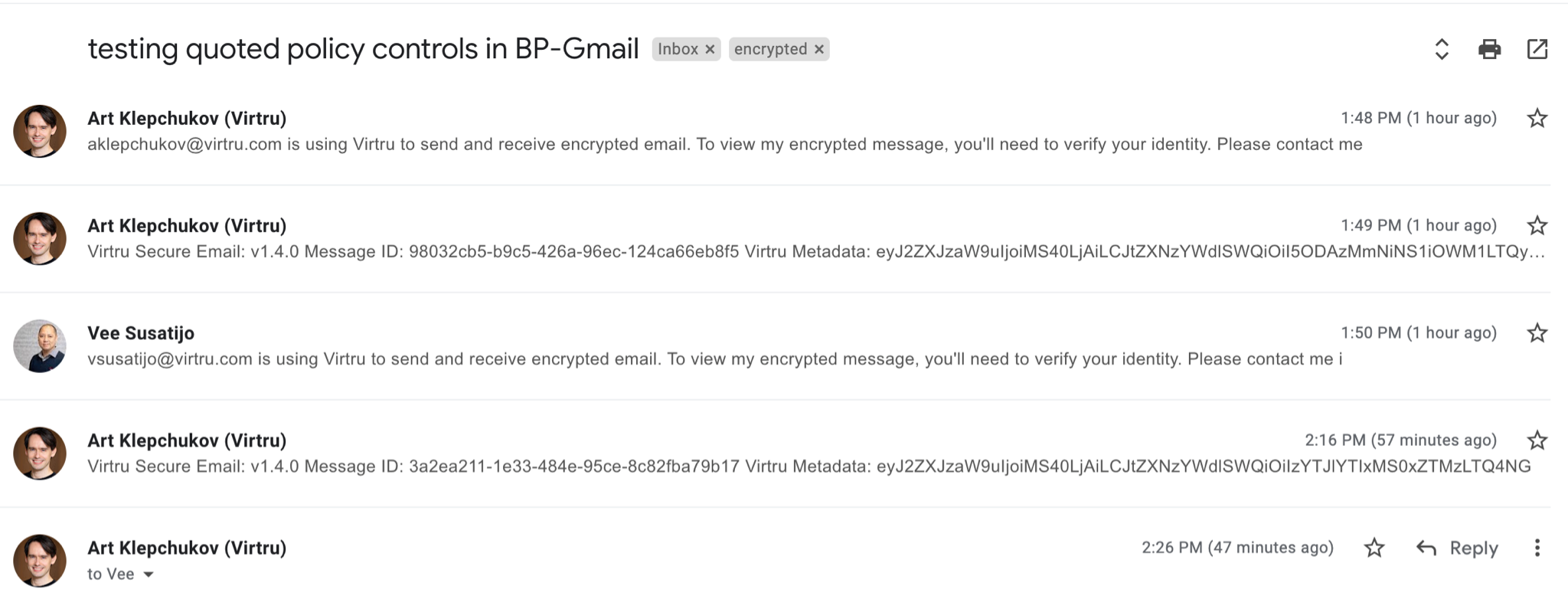
- Messages with a shared subject line are displayed in a list where each message is given a similar visual treatment.
- Earlier messages are visible by default.
- Messages may or may not have quoted content in the body of each email. Expanding the quoted content shows earlier messages.
- Typically chronological (oldest to newest)
Quoted content in the body of an email
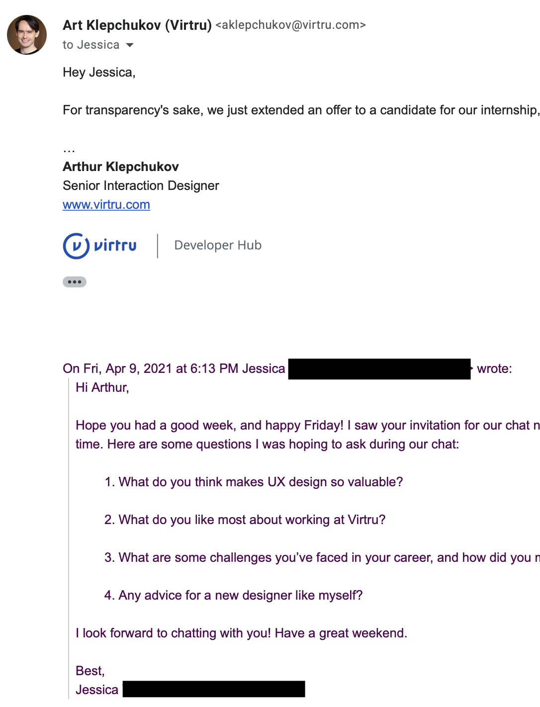
- When composing a reply or forward, most email clients insert the previous message body as a quote into the bottom of the new email.
- When reading an email with a quoted message, earlier messages are collapsed by default.
- Quoted messages are given different visual treatment from the currently viewed or composed message.
- Typically reverse chronological (newest to oldest)
Both conversation view and quoting preserve context. Either would help SR users understand more about where the currently unlocked message fits in. So which should we do?
Conversation view as "SR threading"
Upsides- Easier to follow the conversation because each message has the same visual weight.
- Existing message design already works for smaller resolutions like mobile web.
- Future-proofing SR — a similar visual treatment of each message leaves room to show security controls (e.g. revoke, expire, watermark, etc.). This enhances the security of messages you send.
- Future-proofing SR — a similar visual treatment of each message leaves room to reply to earlier messages directly from SR.
- For performance reasons, we shouldn’t load the entire conversation like an email client. Decrypting every earlier message would make reading the latest message take too long.
Quoted content as "SR threading"
Upsides- Since the UI emphasizes the current message and not earlier ones, it’s faster to read.
- Also faster to scan for and read in cases where earlier messages aren’t useful or necessary to the context of the current message.
- Each quoted message shrinks the width available to display the message body, like Russian nesting dolls.
- Readability suffers for longer conversations.
- Because SR has to work on mobile web at a minimum resolution of 375x667, there may be no readable mobile layout for longer conversations. Landscape orientation could help here, but if the quotes continue, that will eventually find a limit as well.
2. Account for all message states
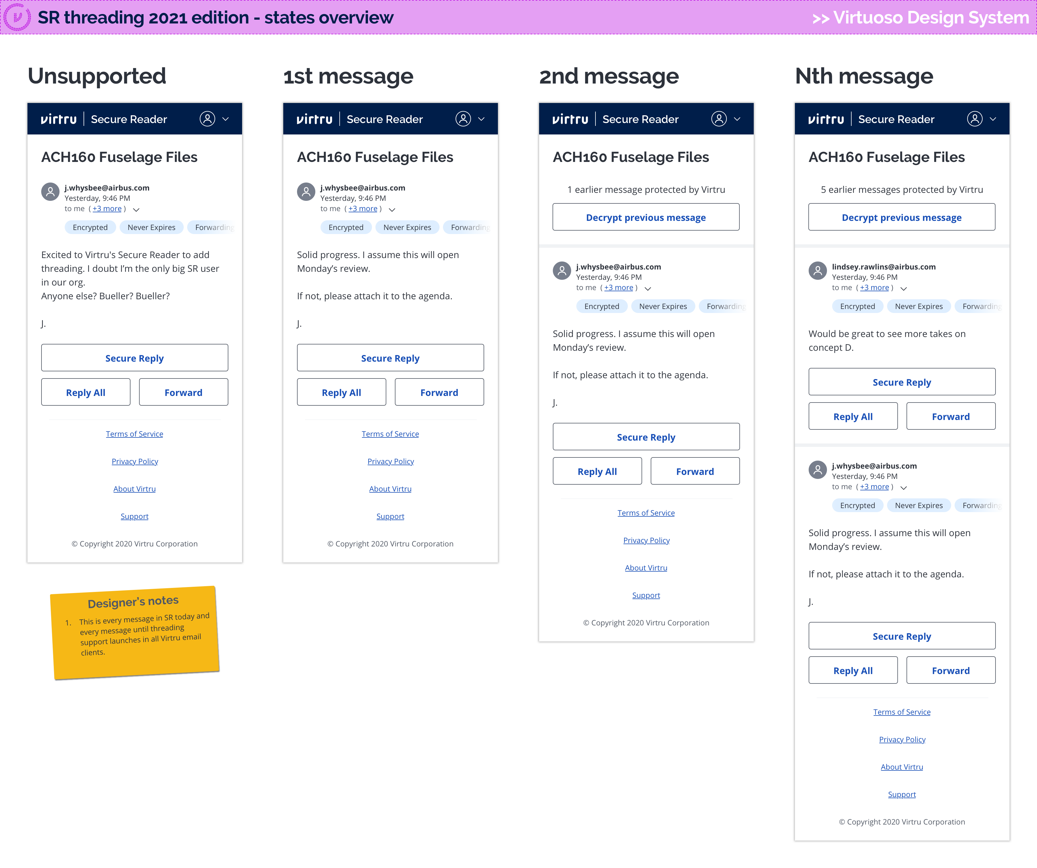
I sketched out the message states in my notebook as I understood them. Engineering helped me confirm and revise the possible transitions:
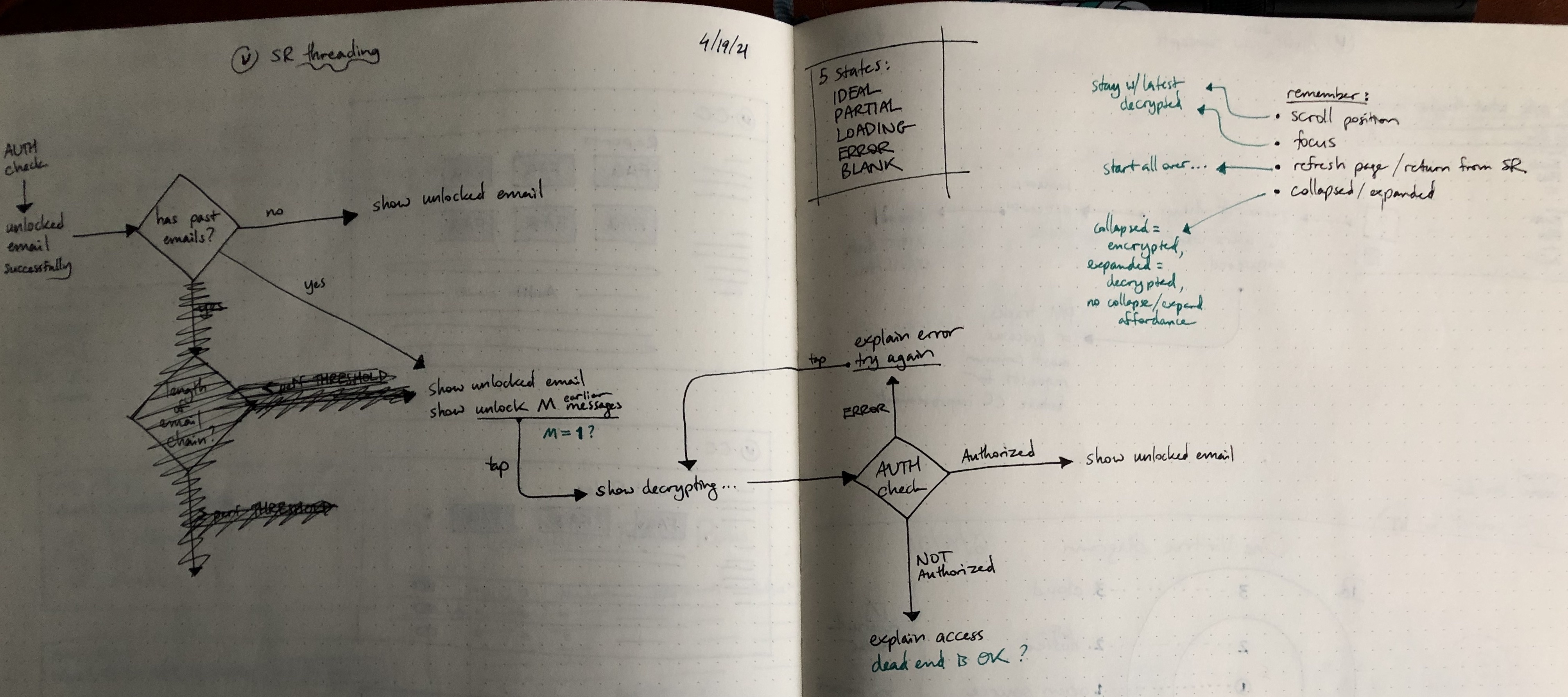
I'm a fan of using the five states from Scott Hurff's UI stack as a starting point for most designs: ideal, loading, error, partial, and blank.
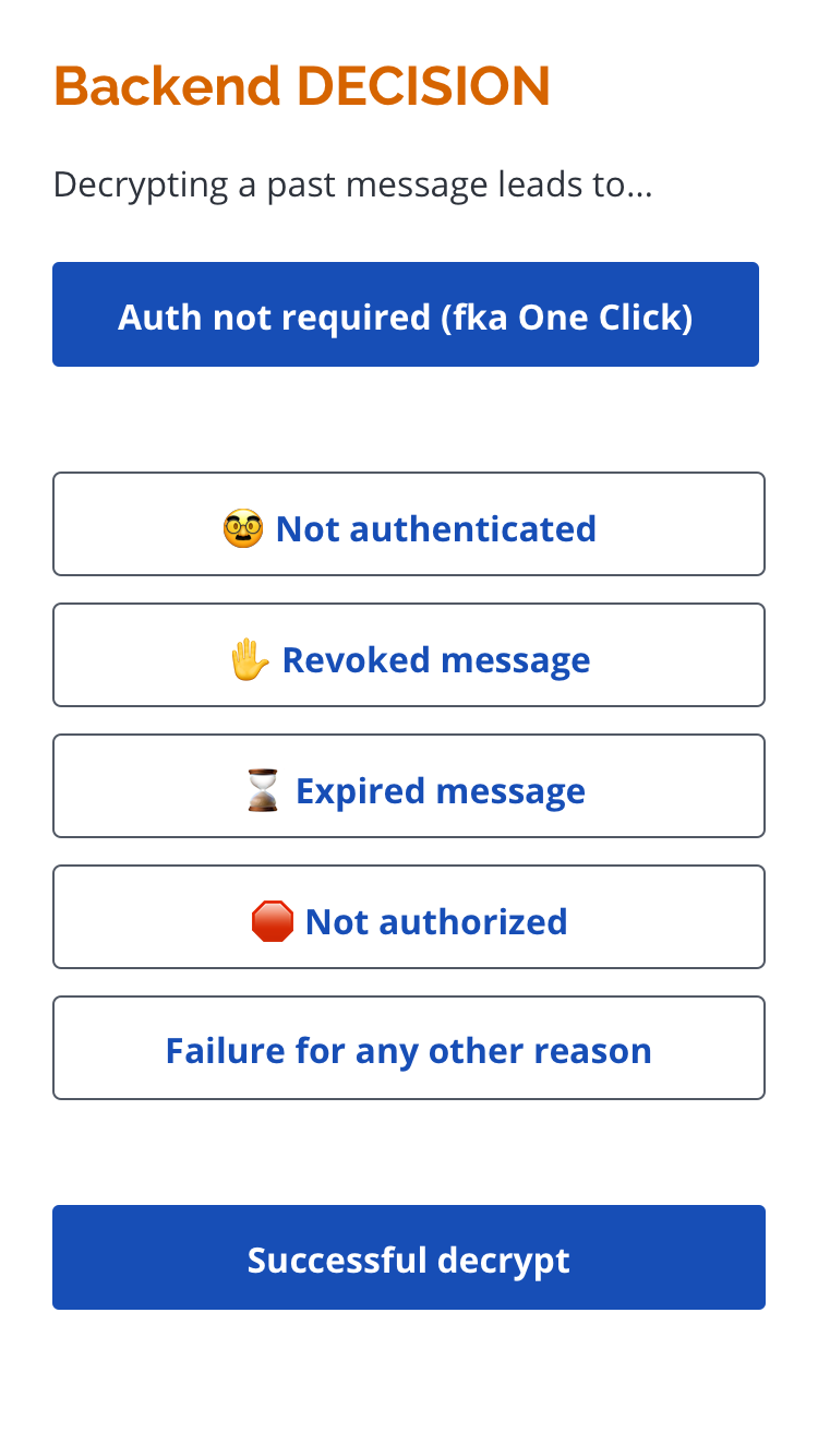
But the five states wouldn't be enough considering how many possible states there are for each encrypted messages. These became my design checklist to confirm I covered the entire experience:
- nothing to decrypt
- attempting to decrypt
- no authentication required to decrypt
- authentication required to decrypt
- access will expire
- access has expired
- access revoked
- not authorized to decrypt
- can decrypt
3. Design for mobile web
I started with mobile designs; it's easier to scale up to larger screens than shrink the experience down.
If this is our current state (1 of ? messages in a thread decrypted)…
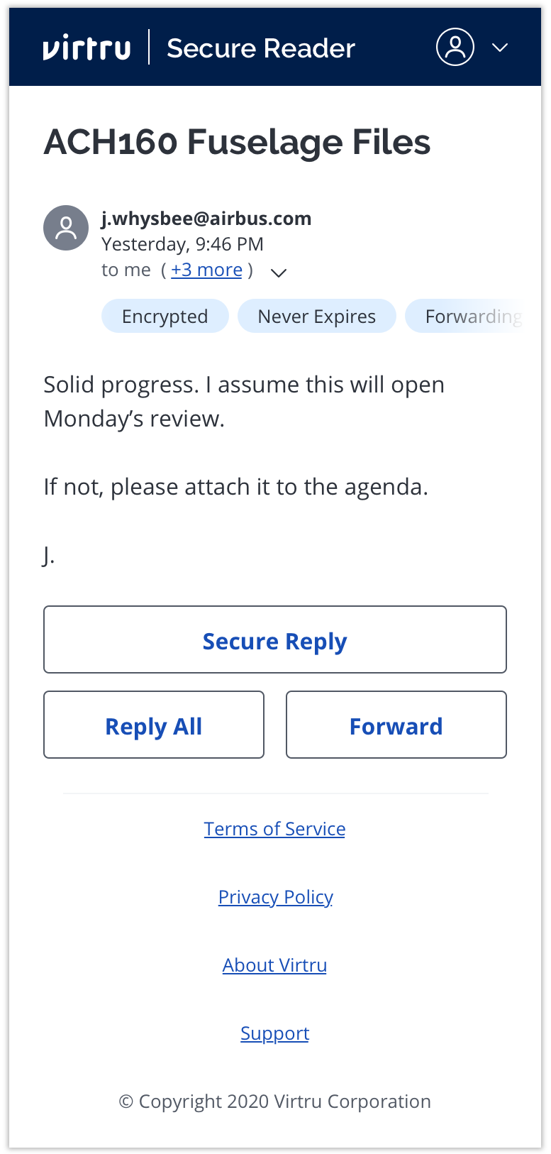
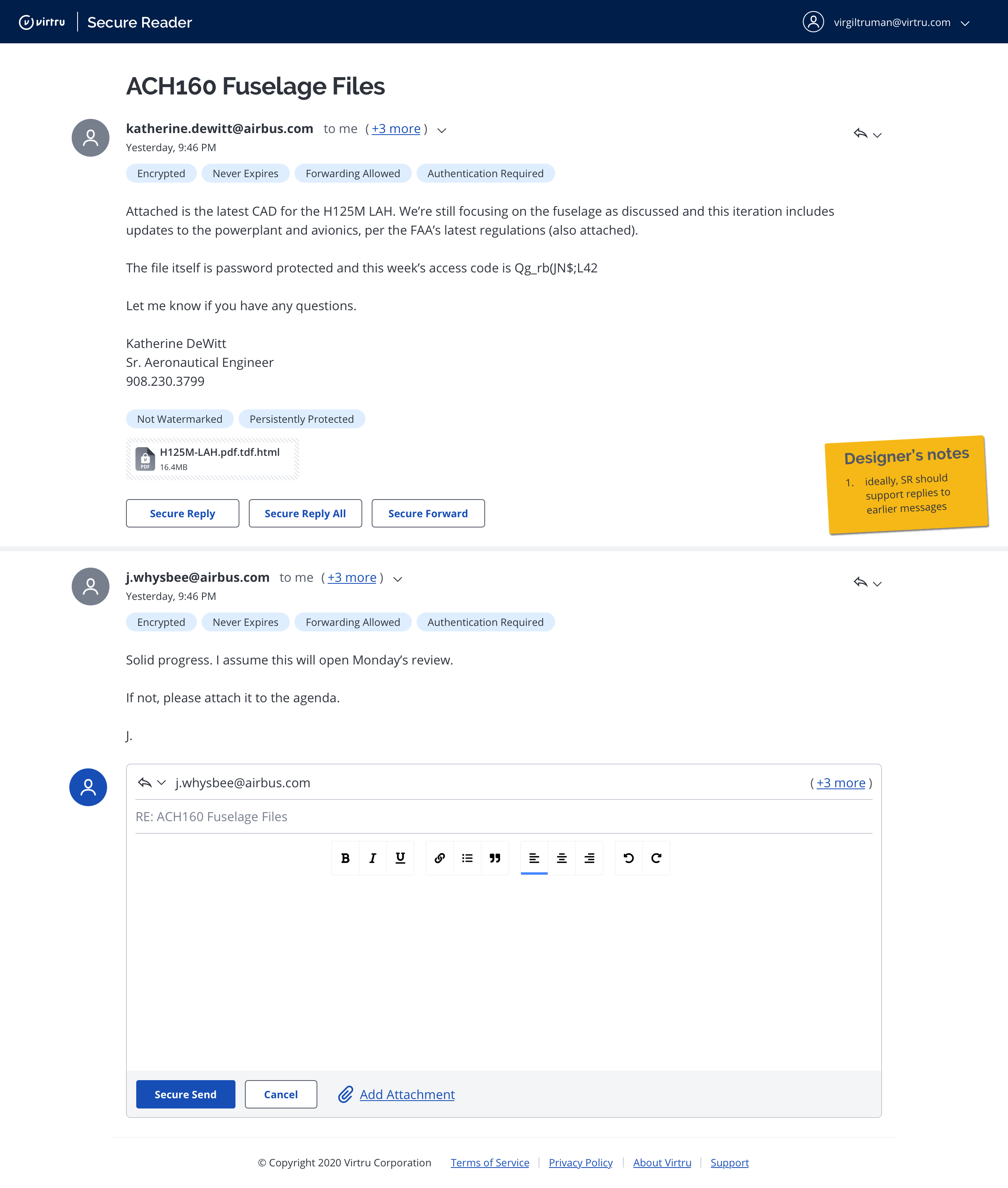
An ideal state would be (all messages in a thread decrypted)…

We just need a transition affordance, like "Read previous [message]" or "decrypt previous [message]" to start off the process. Ideally, reading previous messages scales to long threads without security or performance penalties.

Here's what a transition looks like…
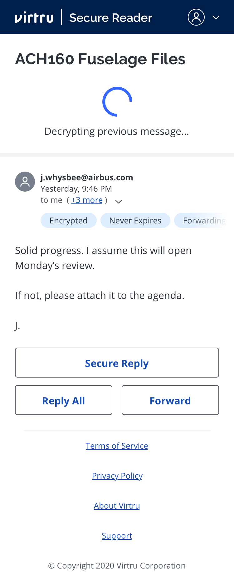
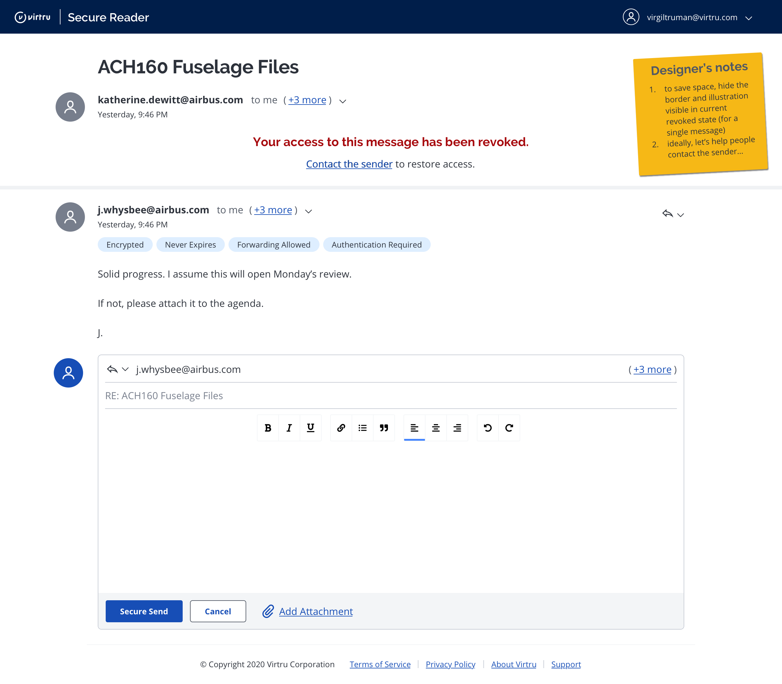
Many things can go wrong when trying to decrypt a previous message (as listed in the section above). My designs included many auxiliary screens to describe security logic:
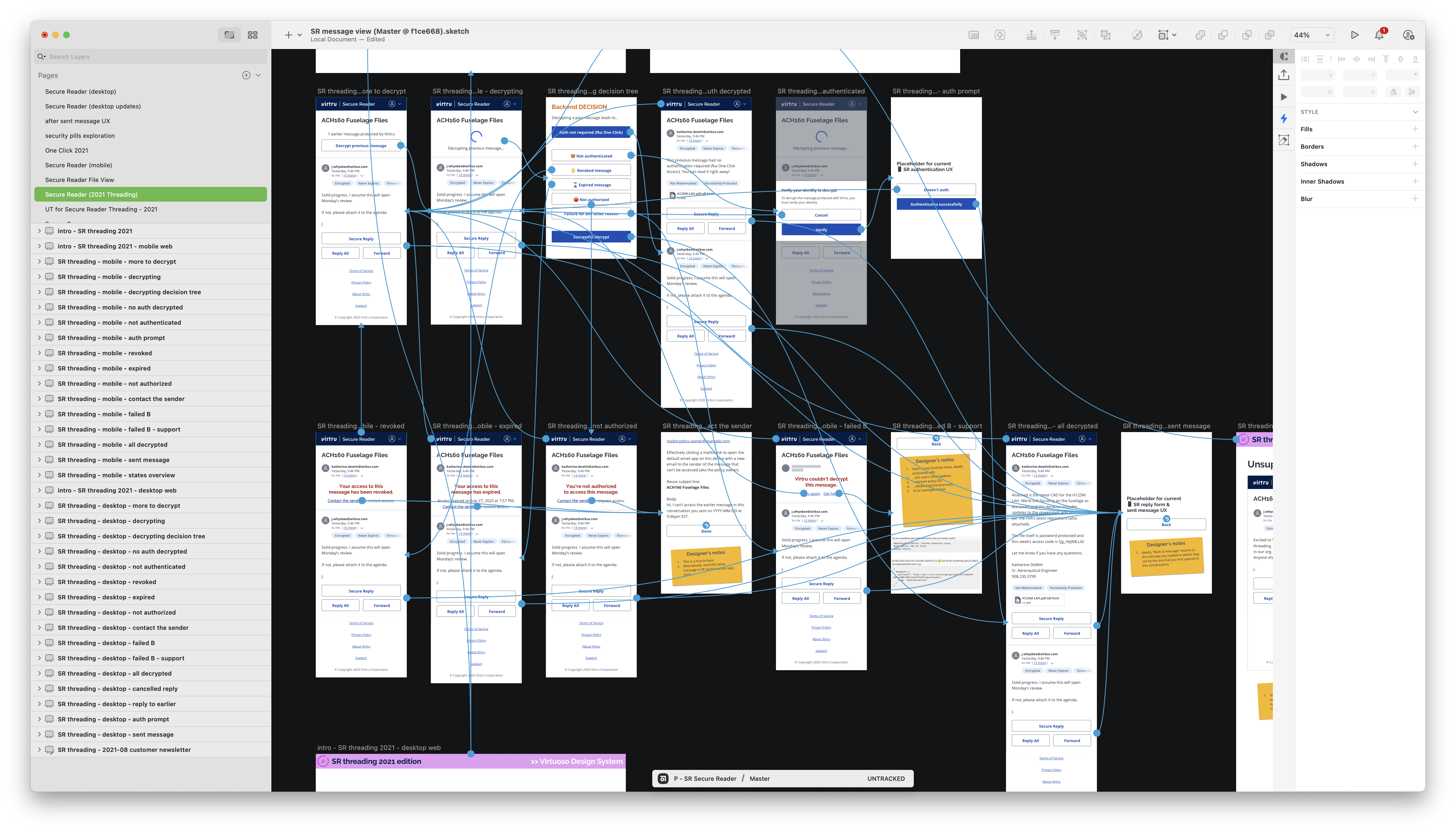
Though the number of interactions and hotspots exploded…
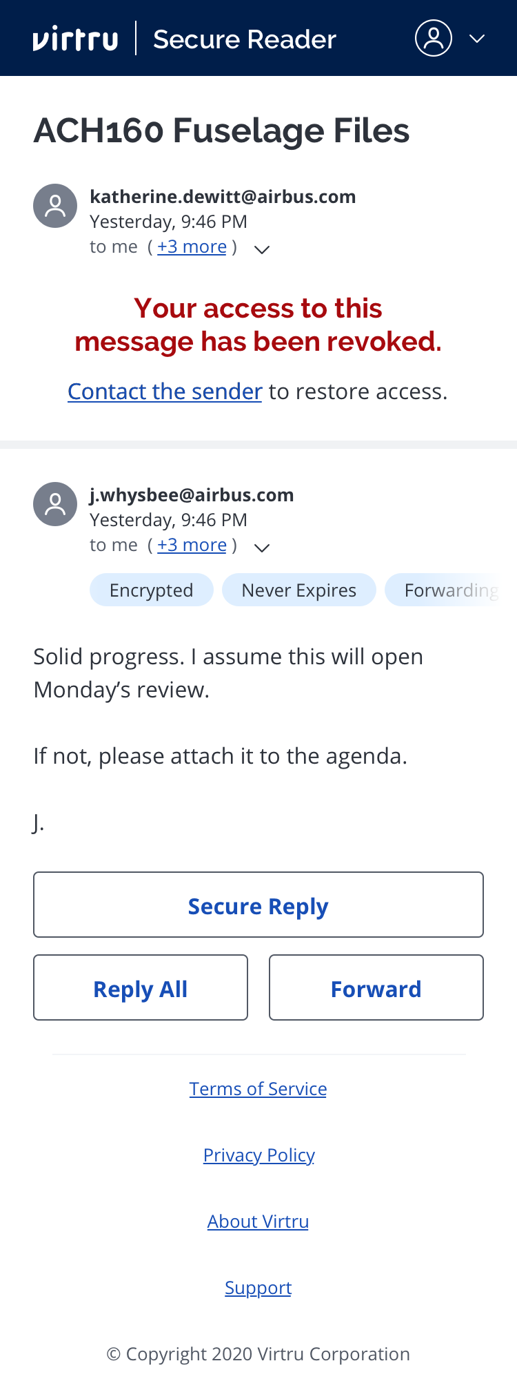
 …most error states were as elegant as this…
4. Confirm direction with stakeholders
When I demoed the mobile web design prototype before proceeding, there was pushback from stakeholders. I persuaded the team to not decrypt more than one previous message at a time.
Everyone was excited we were bringing threading to Secure Reader (SR). But most people asked why we weren't decrypting the entire thread of previous messages.
How I defended my design of one previous message at a time:
-
Simple enough to learn
We decided to not pause for primary user research up front, but there's more than one possible solution. Customers did not express a preference for how Secure Reader should do email threading. The quoted approach to threading, which we are not pursuing, could be what ultimately works best. So why build the maximum version of conversation view without this clarity? -
Performance concerns
How would decrypting more than one message at a time stay quick and accessible for longer threads? We already have at least half a dozen error states for each message, how would we handle errors for multiple messages? -
No historical data
We had no data on how far back in a thread customers read or want to read. This was not something we tracked in Virtru's other email products.
5. Design for desktop web
The mobile screens scaled up nicely to the larger resolution of desktop browsers.
Here's what a transition looks like…
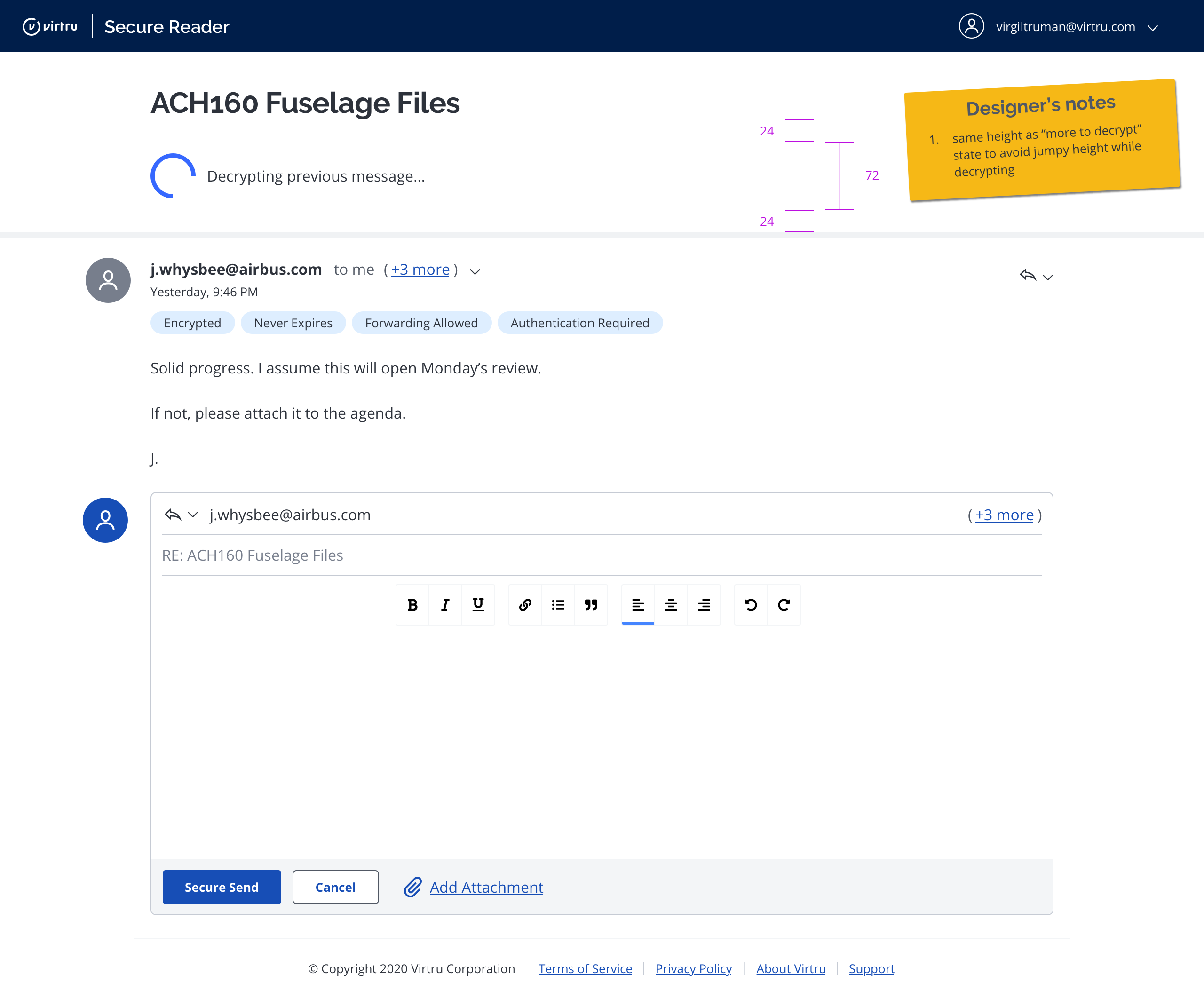
An example error state…
An ideal state (all messages in a thread decrypted)…
6. Usability test
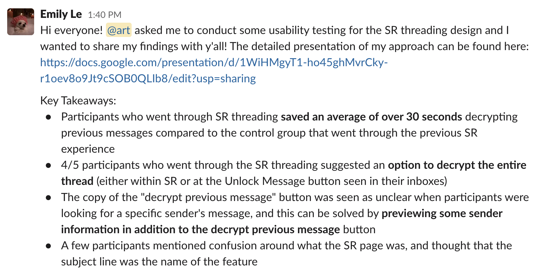
Before launch, I worked with one of our User Researchers to evaluate the effectiveness of the design with 10 external users. We recruited participants via UserTesting.com. We split participants into two groups—current experience vs. new experience.
Current experience—no threading
- See Gmail inbox with unread messages
- Open Gmail conversation to see latest message encrypted
- Load Secure Reader in new tab to decrypt
-
See latest message decrypted (2 of 2)
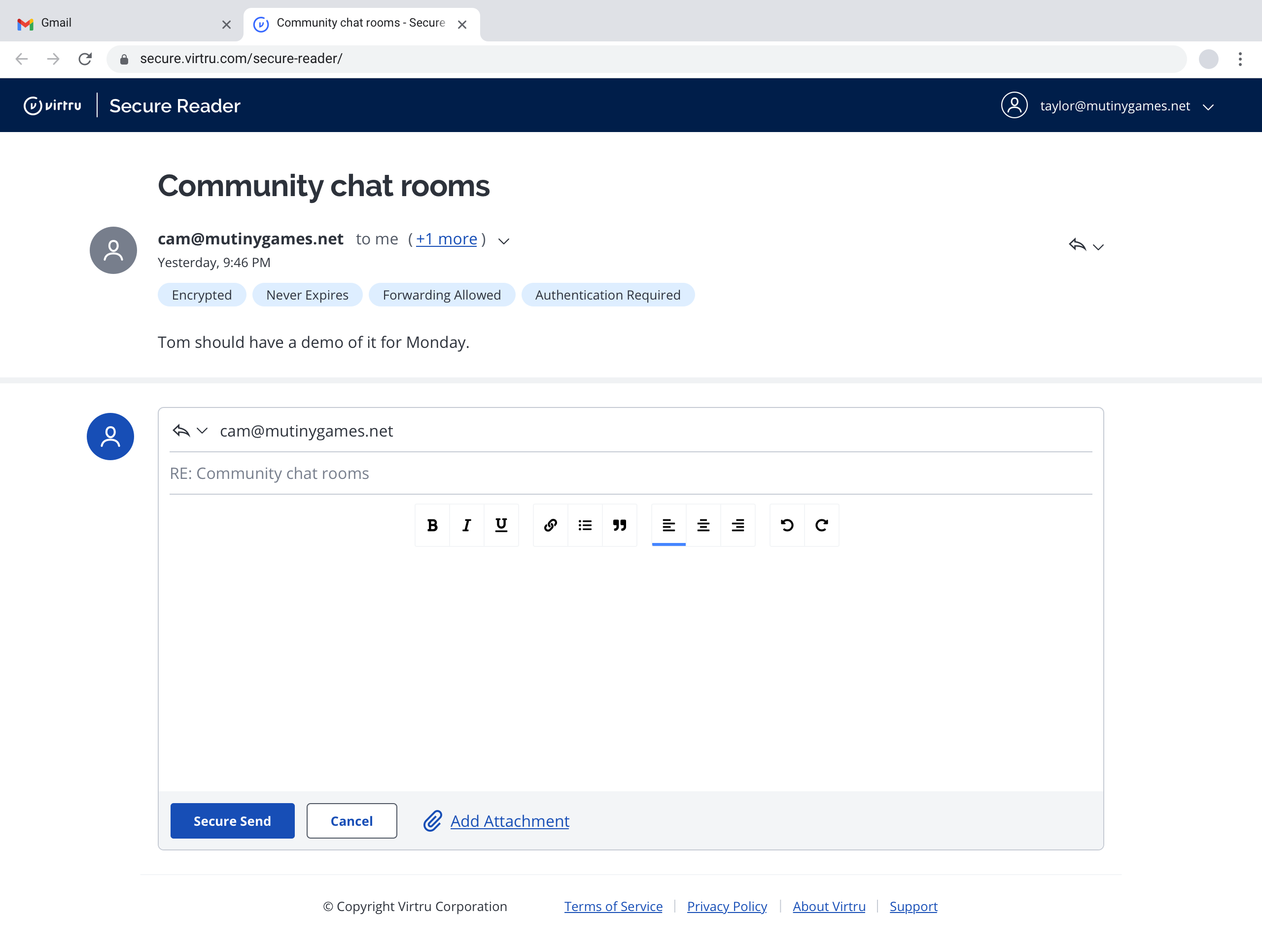
- Navigate back to Gmail conversation
- Expand previous message in Gmail conversation
- Load Secure Reader in another new tab to decrypt again
- See previous message decrypted (1 of 2)
New experience—threaded secure messages
- See Gmail inbox with unread messages
- Open Gmail conversation to see latest message encrypted
- Load Secure Reader in new tab to decrypt
-
See latest message decrypted (2 of 2) with link to previous
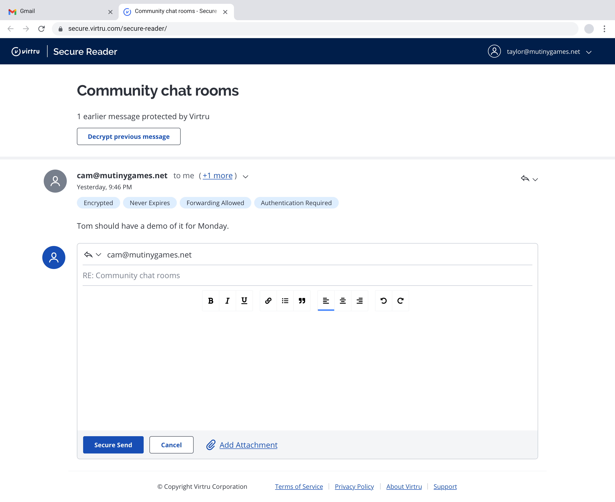
- Load previous message
- See previous message decrypted (1 of 2)
We hypothesized that participants would spend less time to get to previous messages with the new experience and rank it as easier to use.
Our hypotheses proved accurate, so we proceeded to production.
7. Track production metrics & customer feedback
I advocated for us to measure more than simple clicks on the previous message CTA. With my involvement and planning, we were able to instrument the entire threading experience. Our resident product data expert was glad to be included and helped refine events and properties.
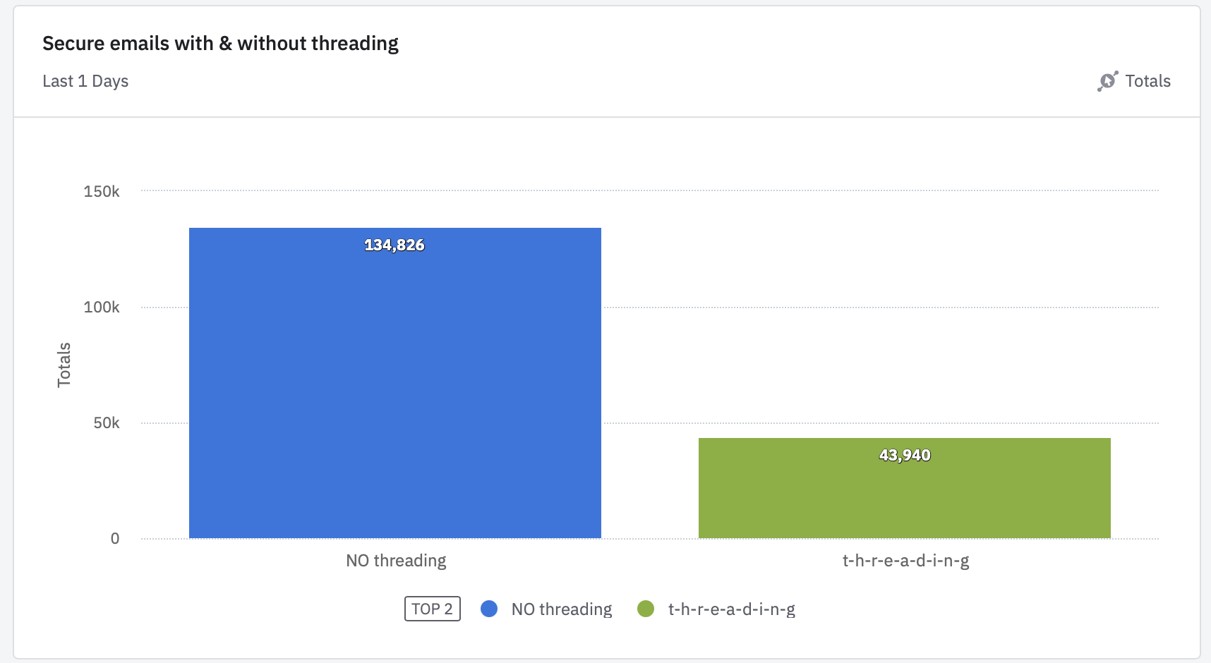
Within a day of launching, threading was available for ~33% of encrypted messages:
Quantitative answers I sought
-
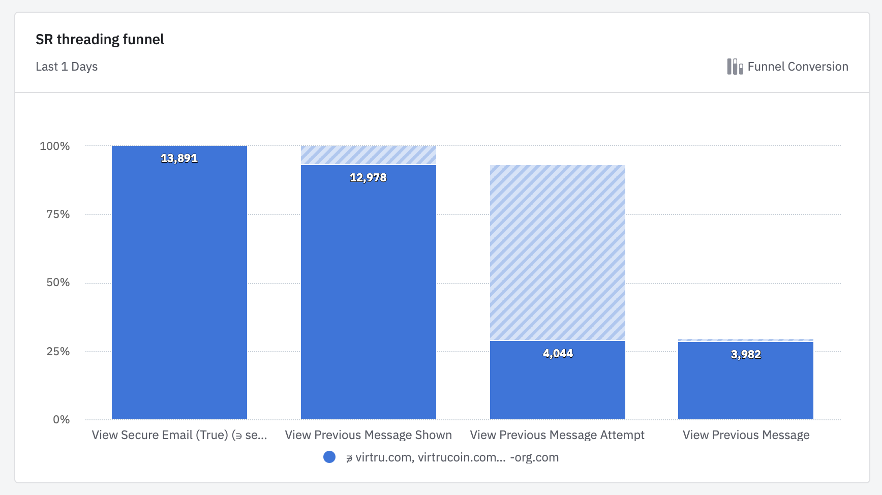
How many people that decrypted an SR message that’s part of a thread, used SR threading to read at least one earlier message?
This helped us know the new UI was being noticed and used.
-
Of those people (in 1), how many previous messages did they try to read?
This helped us decide if we need to build any kind of bulk decryption for previous messages. Since most users only went back 1 message, we built the right subset of this feature.
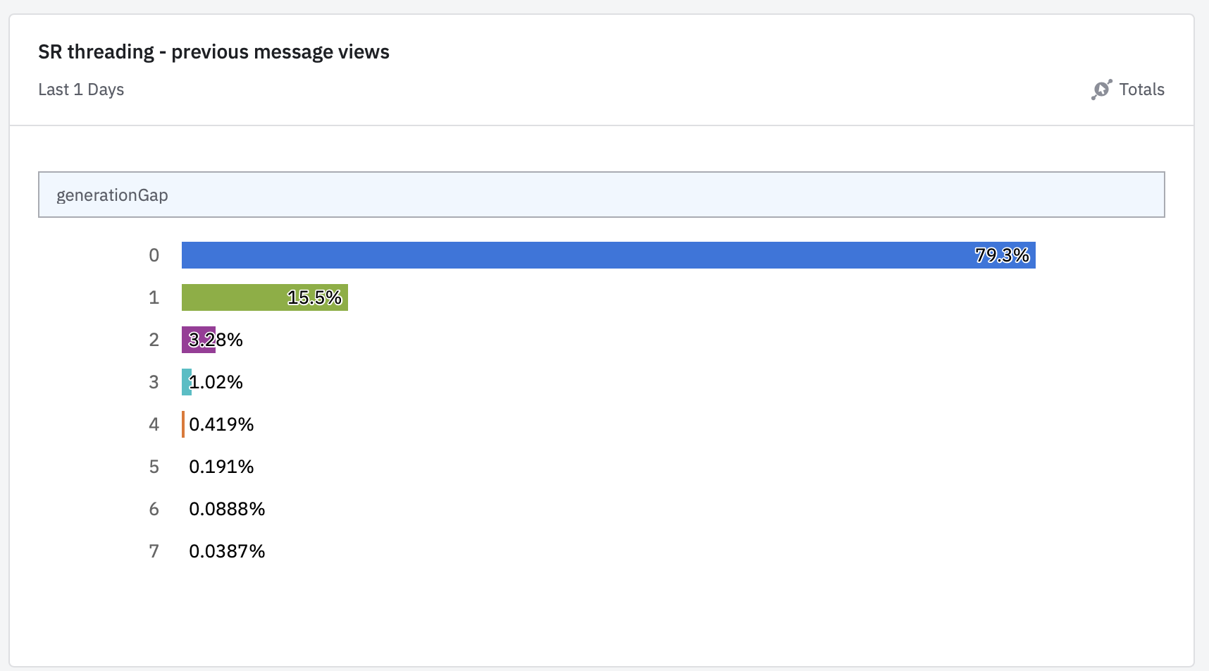
-
What is the success rate of decrypting previous messages in SR threading? How does that compare to the success rate of decrypting in SR overall?
This helped prove we actually solved the user problem of seeing earlier parts of the conversation without going back to their email.
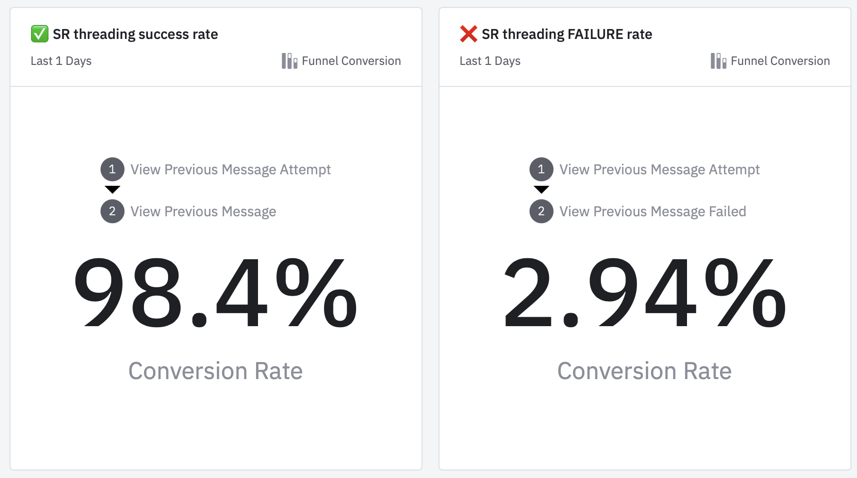
Qualitative feedback
Equifax loves it. Verizon didn't realize it rolled out but after we showed them they were happy about it. Capital One felt similarly.
- Virtru Enterprise CSM
Art's willingness to dig in quickly and iterate on a minimal, slick UX for the feature was key to getting this win. And Secure Reader threading was essential to our successful roll-out at two of our largest customers - Dish and Equifax.
- Virtru CEO
It comes up occasionally and customers are delighted by it.
- Virtru SVP of Customer Success
Retrospective
I'm satisfied with the initial impact of this design. I'll revisit the retrospective when I have more distance from this effort.