Case Study:
Redesign File Viewer for 9,000+ Creative Orgs
Overview
Wireframe & redesign a file viewer for displaying 50+ file types online—a core part of the review workflow for 9000+ organizations.
Skills Used
- wireframing
- visual design
Problem Definition
Submittable provides online tools to manage submissions and applications. A core part of this product involves reviewing various uploaded files to judge any given submission. Our previous file viewer implementation and interface depended on a Box library that Box would discontinue. This external deadline created an opportunity to revisit the UX for reviewing any kind of file Submittable accepts. The previous file viewer had discordant interfaces for viewing text-based files, images, audio, and video. It was responsible for over 50 distinct file types. We defined success as a consistent interface that was no longer dependent on Box.
Audience
Our target users were the majority of the 9,000+ Submittable organizations who used our online file viewer to review submissions. This excluded the minority of organizations who reviewed files outside of Submittable—paper, Kindle, or offline. A specific ratio of organizations who used our file viewer to those who reviewed files elsewhere was not available or measured.
Organizations ranged from literary journals with a single editor to large teams with multi-stage review processes.
No personas existed; due to the strict engineering deadline, we did not invest time to create them.
Team
As Senior UX Designer, in August 2017, I joined a team consisting of:
- a visual designer—first half of project
- a product manager (PM)
- two engineers
From August-October, I ran deliverables by the visual designer and the PM. Afterwards, I largely collaborated with engineering on the implementation.
Constraints
Our primary constraints:
- Hard deadline to be in production for 100% of Submittable organizations by January 15, 2018—when the Box View API would be discontinued.
- I was 100% remote for all but the initial 2 weeks of the project. This limited time for any casual, in-person testing.
- I planned to take one month of paternity leave in early Fall 2017.
- Our only source of user feedback were customer support requests. We did not budget time for prototype or usability testing due to the hard deadline and uncertainty with how much time engineering would need for the new implementation.
- Our visual designer left before project completion
Design Process
-
Engineering and the PM requested mockups in InVision for viewing:
- text-based files
- image files
- audio files
- video files
- I advocated for and got buy in to create more iterative designs consisting of paper prototypes and wireframes.
1. Understand and Evolve the Spec
The product manager started a spec with what functionality and UI affordances the new file viewer had to support. She also collected a few UI examples of other viewers in an InVision board. I started capturing screenshots of how our current viewer handled various file types. I noted inconsistencies, got clarifications about historical decisions, and captured cases not covered in the spec. For example, how do we handle files a submitter can upload but our file converter cannot render, such as executables?
2. Experiment with Paper Cut-Outs
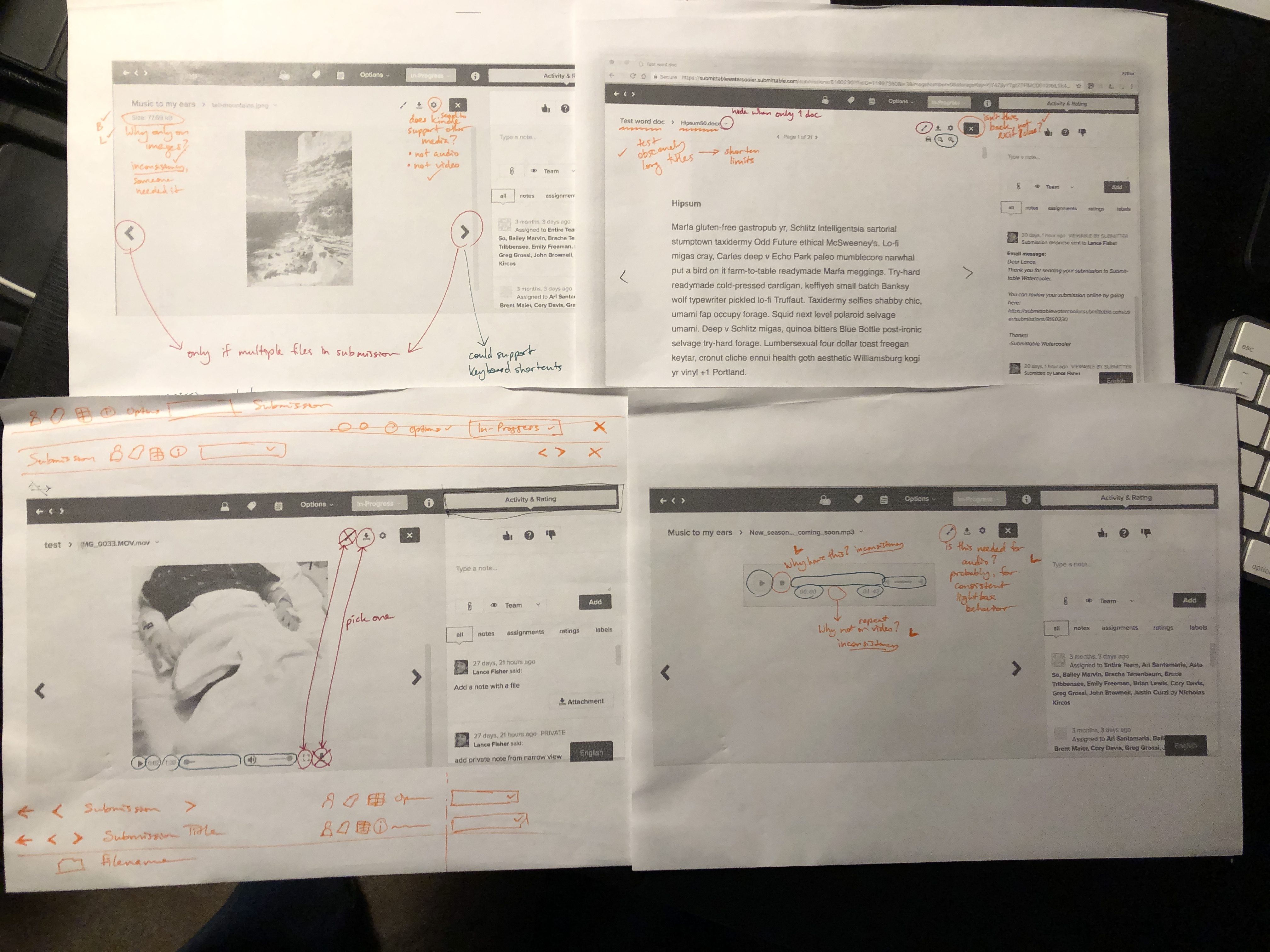
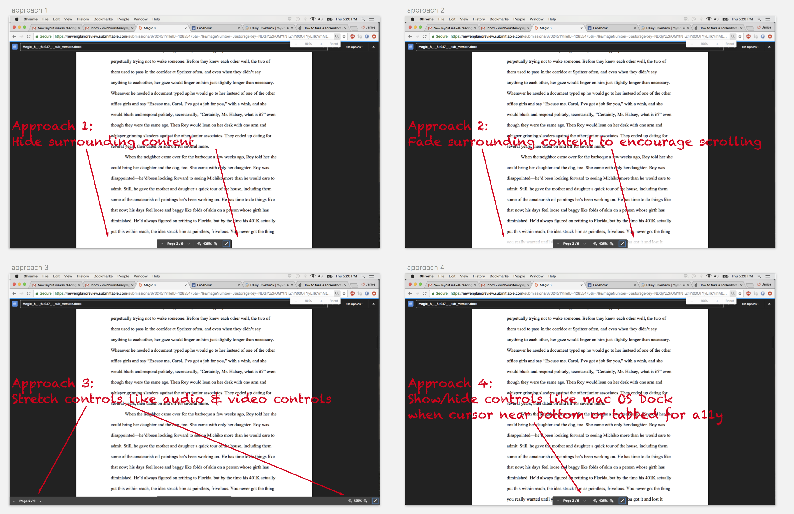
Due to the increasing number of states across the four file types (text, image, audio, video), I began on paper. I sketched affordances, cut them out, and rearranged them. The goal was to create more consistency across file type controls that are not naturally related.
Can we find consistency across affordances like previous/next page in a document and volume controls in audio & video?
Afterwards, I worked bottom-up from the smallest UI elements to larger patterns. I played with different hierarchies within the file viewers.
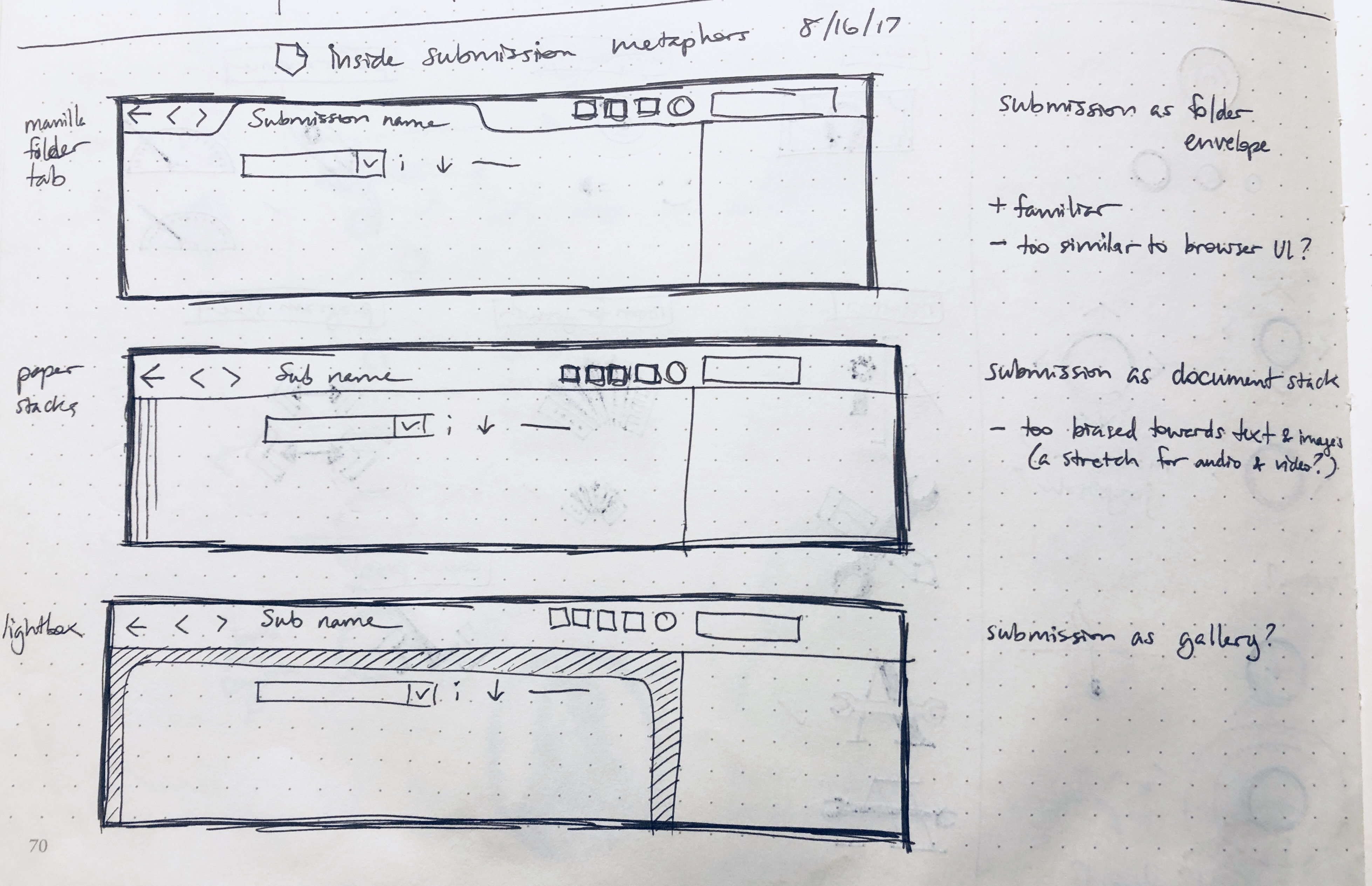
I shared these concepts in person with the PM, the visual designer. I proceeded to wireframes without significant feedback.
Being in person was invaluable to physically moving around UI affordances in meetings, though I subsequently didn't capture all the states we experimented with.
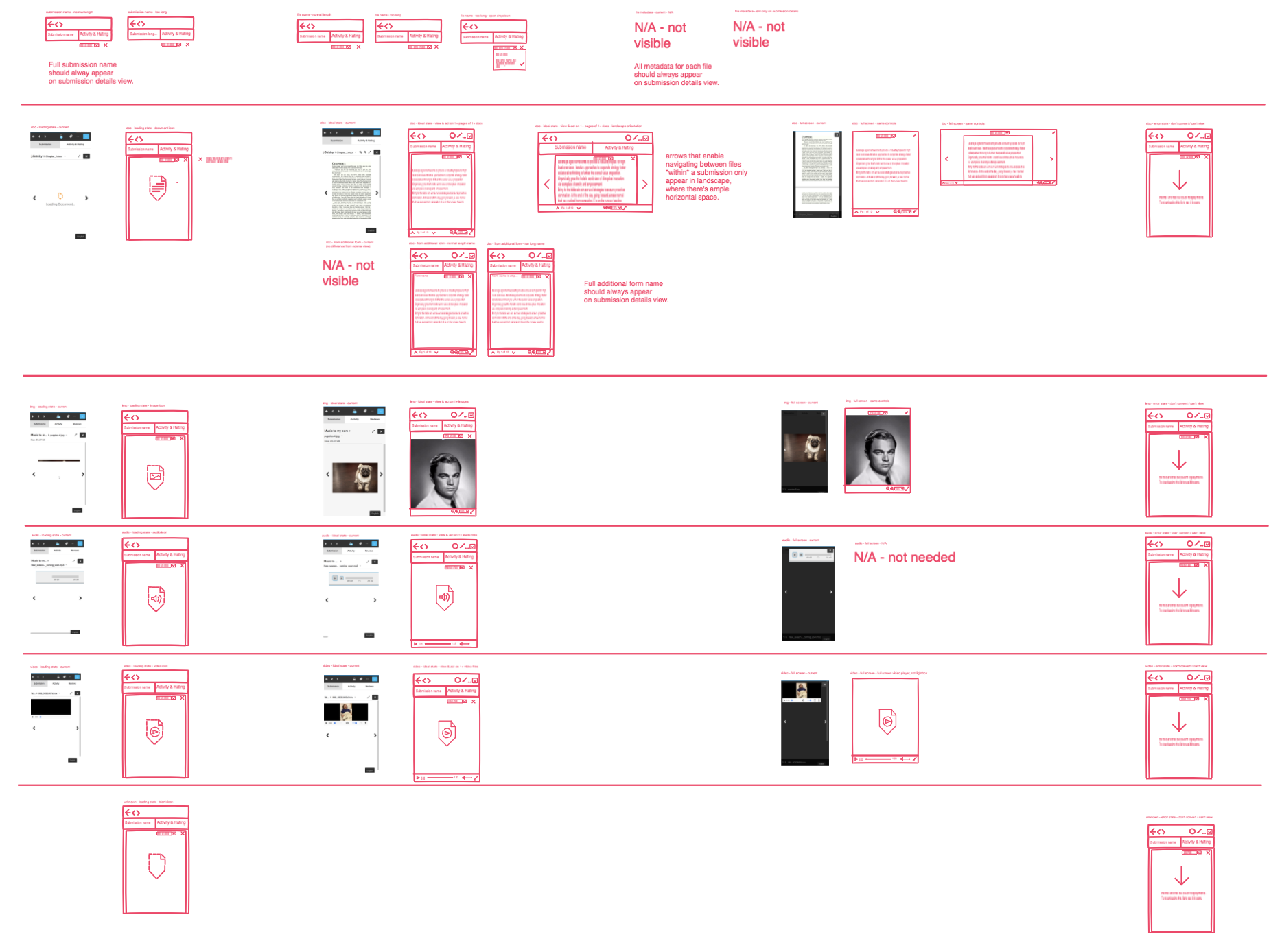
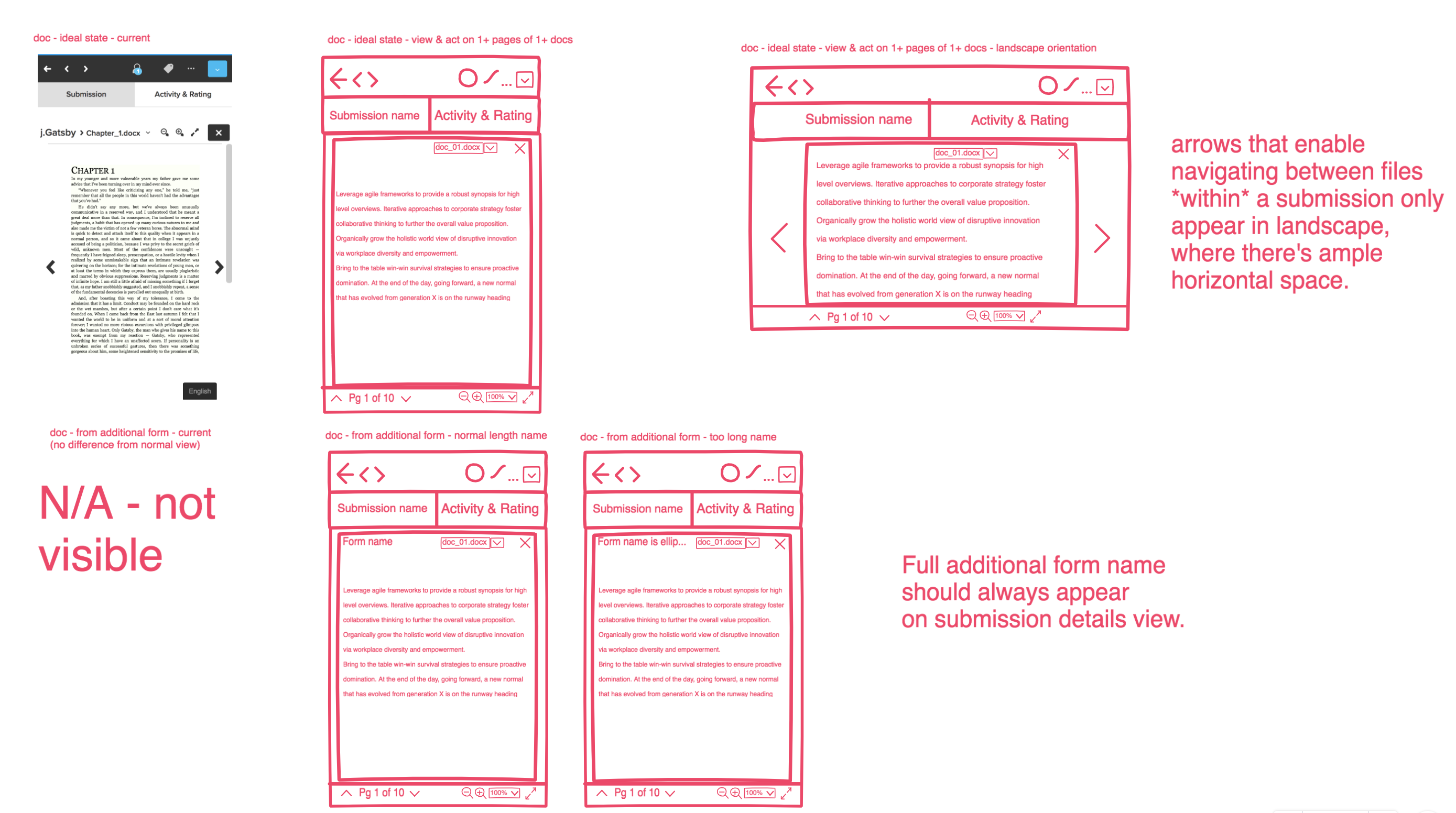
3. Create Thorough Wireframes
There were no wireframes or wireframing process at Submittable. I decided to introduce InVision Freehand to the team since we were already using InVision prototypes. I hoped the monochrome palette would make it clear these weren’t the mocks the team expected from me.
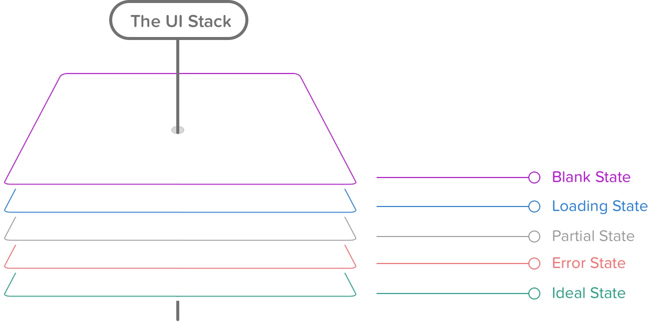
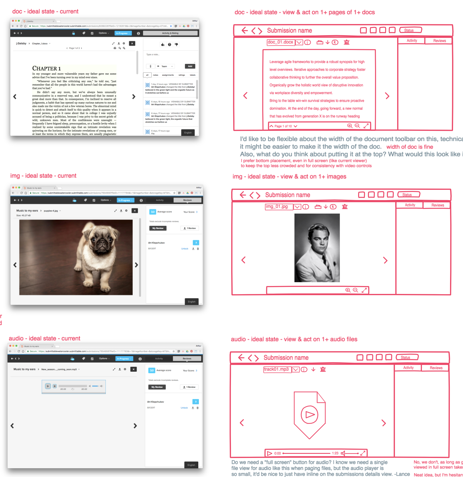
I employed Scott Hurff's UI Stack concept to structure my wireframes into more thorough states.
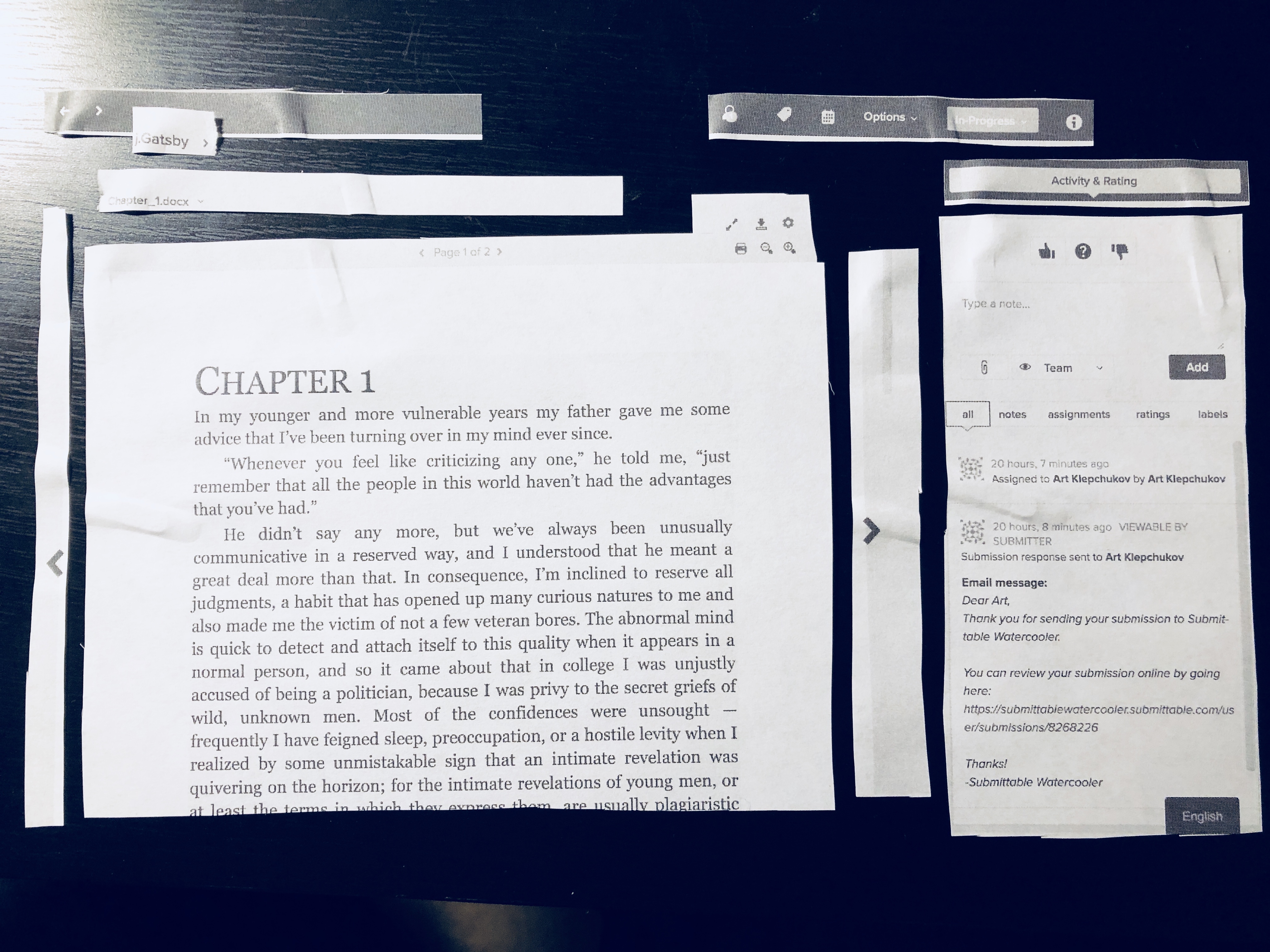
I surprised my team with the number of states I covered. They wondered how these states rendered in our current viewer. Thus, I included a screenshot of the current state before each wireframed screen.
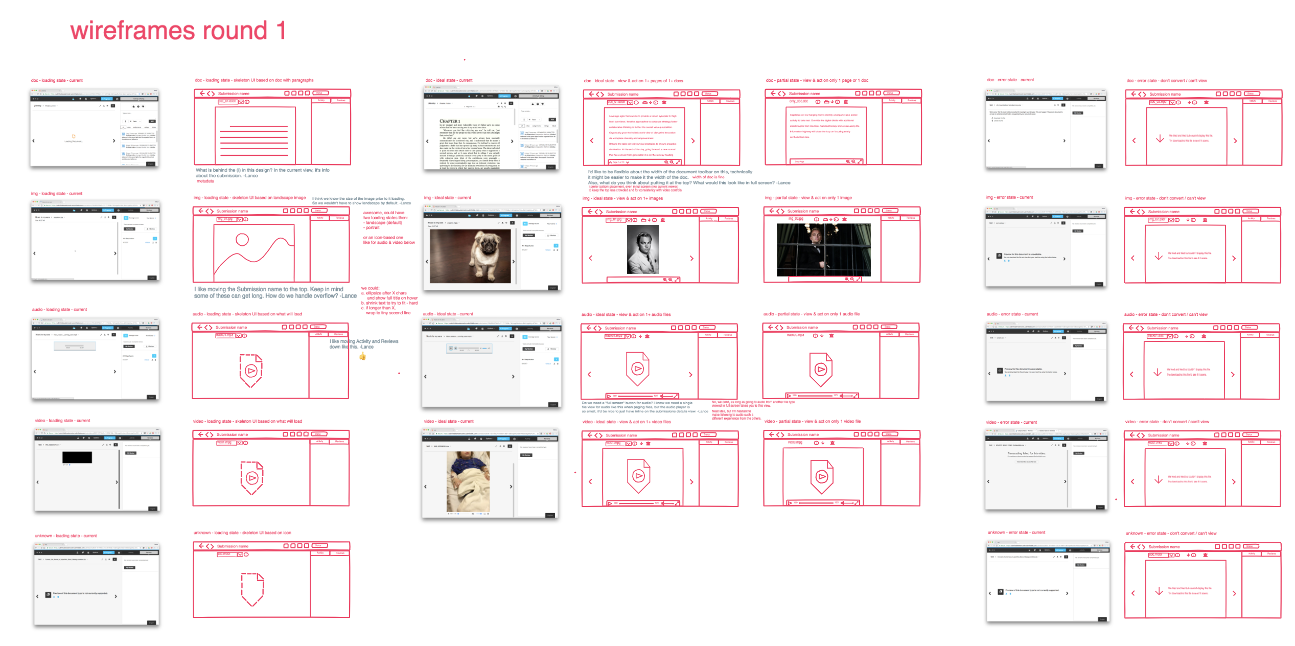
Freehand made it easy to show many low-fi screens at once, but quite difficult to leave comments.
Users could only comment by inserting text into the Freehand itself. This proved to be a frustrating and limiting deviation from InVision prototype comments.
Only at this point did the visual designer inform me that we would also need mobile web designs for the viewer. I regretted not seeking that clarification up front in the spec, but added the mobile states:
4. Start Mockups
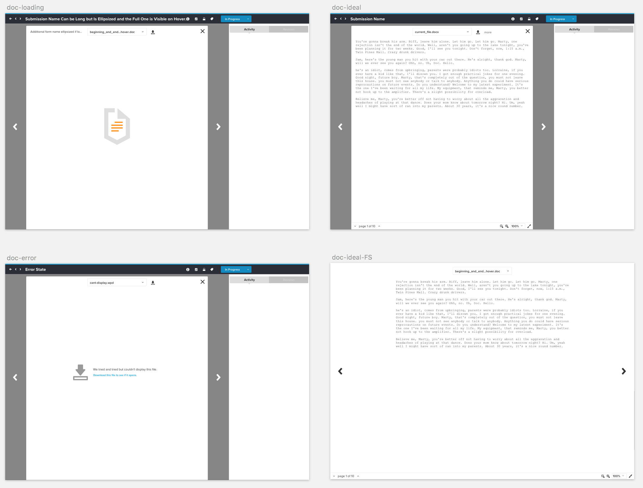
By September 2017, I expected to start paternity leave any day. After I got approval for my wireframes, I proceeded to create the first mockups in Sketch.
I started with viewing text files. Engineering agreed that text files were crucial and they would start with that viewer experience.
When I finished the initial mockups, I walked the visual designer through my InVision screens and Sketch artboards. Then, I went on paternity leave for 30 days.
5. Iterate on Mockups
In the intervening 30 days, the visual designer had iterated quite a bit on my initial mocks.
I returned from paternity leave just as the visual designer announced she was departing from the company. I iterated on the final visual details to the satisfaction of product and engineering.
6. Iterate in Parallel with Engineering
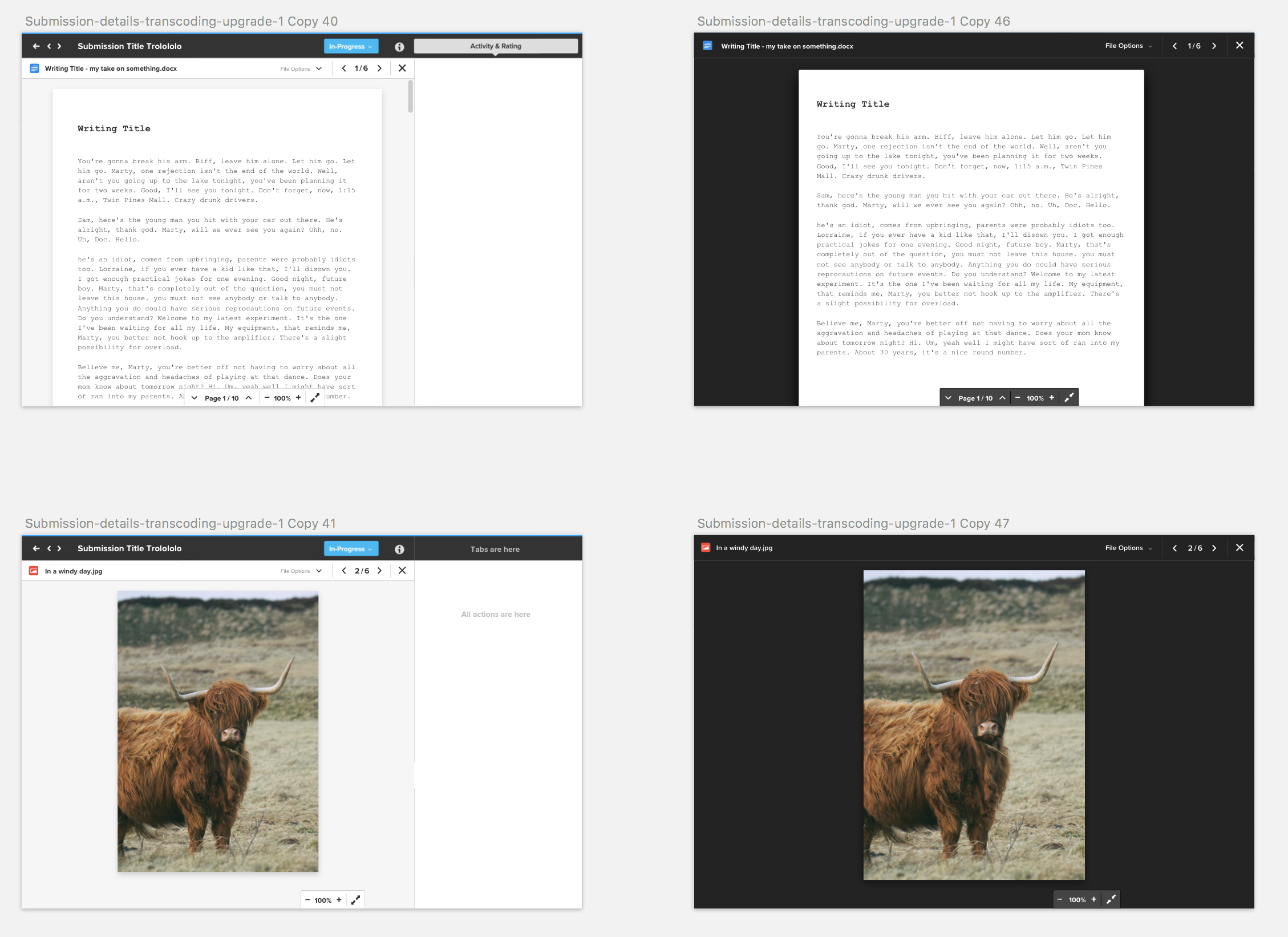
Engineering began building in October 2017. They based the backend implementation on their requirements. They based the frontend implementation on my final mockups. I worked closely with the lead frontend engineer to work out small details.
I started a Google Doc to keep a running list of improvements based on his emerging implementation.
My feedback took the form of an observed vs. expected list of items for the engineer to triage.
The process worked well for the two of us. We worked through the list, encouraging other stakeholders to provide input. They did so and followed my format.
There were no substantial UI changes at this phase.
7. Iterate After Launch with User Feedback
Our VP of Engineering praised the production release of the new file viewer to being as close to a perfect release as they've had.
Submittable organizations who've been longtime customers praised the file viewer:
"I'm LIKING what I see so far..."
—a longtime customer
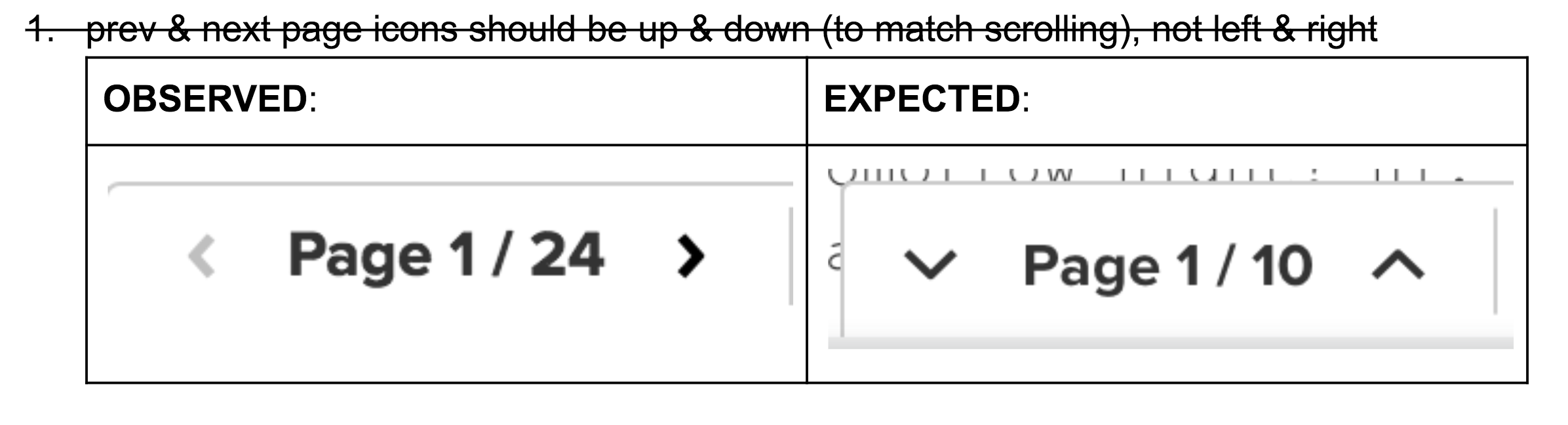
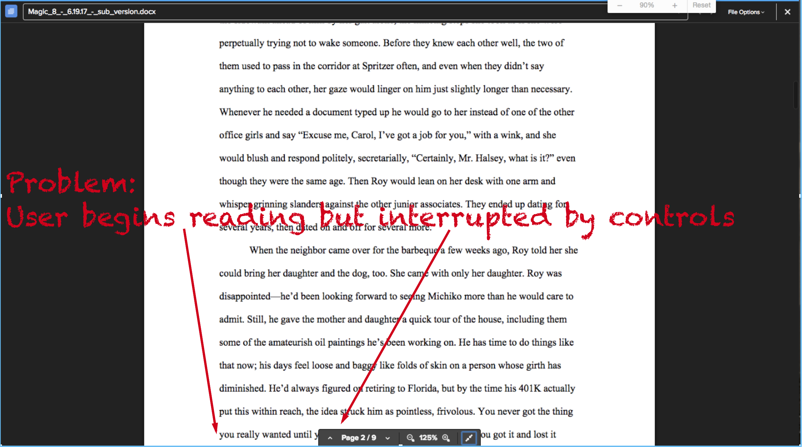
Challenge: an unintentional "notch"
Most customer support requests involved backend issues (e.g. missing fonts, unsupported files). The only prominent UI issue came from the bottom toolbar when viewing text files:
I suggested a few alternatives to our own innocent "notch" problem:
We expanded the toolbar to be full width. This reduced the viewing area by one line of text but never interfered with the reading experience.
Retrospective
We reached our design goal of a new file viewer with a more consistent interface across 50+ file types. Engineering deemed the new viewer a success. We interpreted the lack of customer support issues as a big positive.
I'm proud of covering more states in the new viewer, especially loading and error states for users who experience slowness or problems. The mobile redesign was also a step in a better direction to serve 20% of our 2017 traffic.
If I were to do this project again:
-
Avoid InVision Freehand for feedback. Commenting by inserting text is a poor feedback experience that didn't reflect well on wireframing as an approach. Seeking comments elsewhere would reduce friction when introducing wireframing to a team unfamiliar with the technique.
-
Trade visual design time for usability testing. This was painfully missing from our process. Perhaps we got lucky that users were happy with the approach our interface took. I prefer to validate my guesses.
-
Seek explicit user feedback, earlier. Submittable is reliant on qualitative feedback and lacks certain product metrics. Thus, I would seek direct feedback from users. During this project I suggested:
- doing a task analysis or otherwise light prototype testing using our InVision mockups
- prompting organizations for file viewer feedback via Intercom while they're in the product
- emailing a follow up survey to organizations who've used the new file viewer
We didn't act on those ideas. Product wasn’t convinced the UI changes were obvious enough such that asking for feedback would be meaningful. I would still pursue some form of follow feedback to test our assumptions, especially at the interaction level.
Before & After
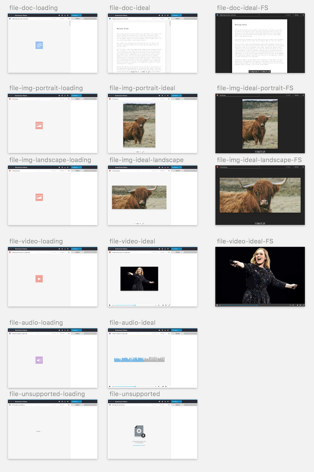
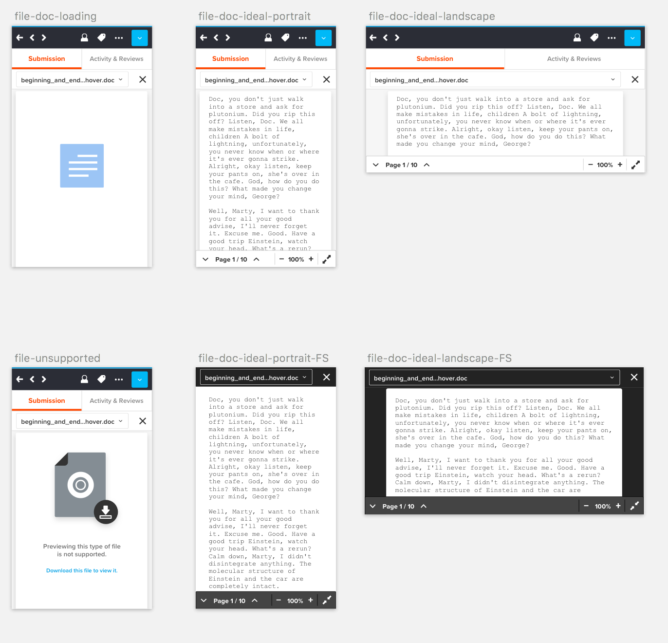
Previous file viewer, July 2017:
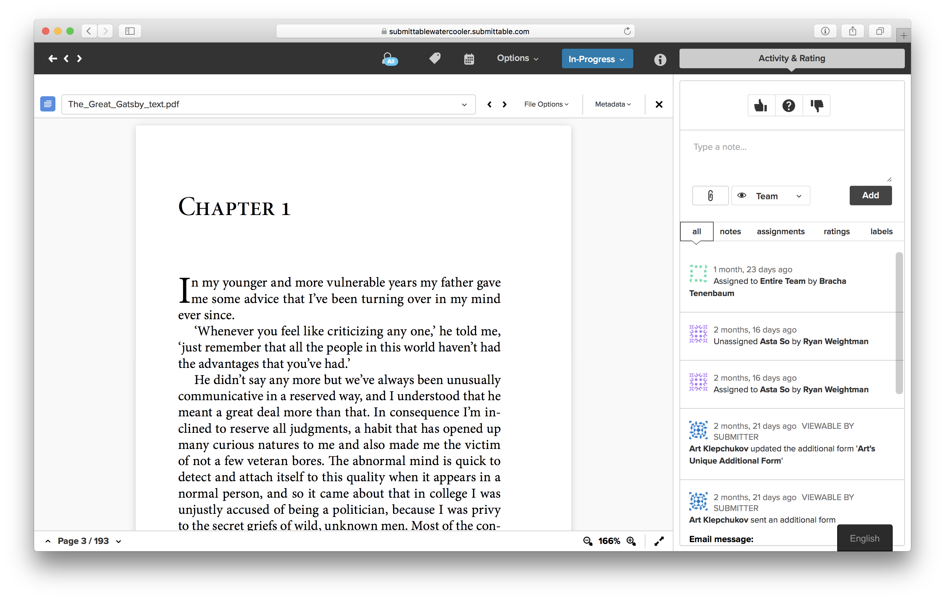
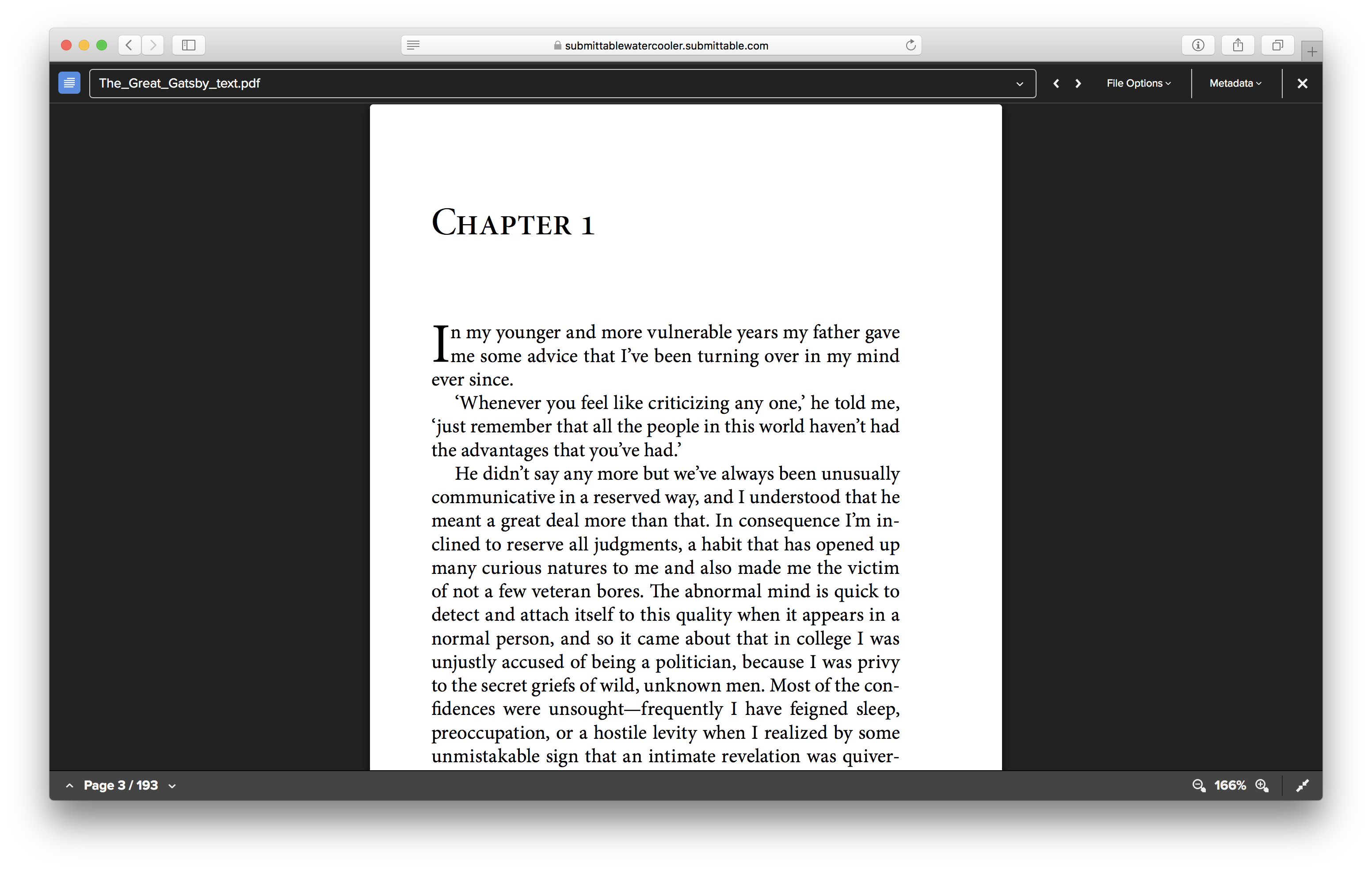
New file viewer, January 2018: